Art Of The Title
An Education (2009) The opening sequences using animation as well as real life images, types of animation used are related to 'Education' such as maths angles, shapes, science equipment, skipping ropes, textiles, paper shapes, music notes, bar charts etc. These are used by themselves at the start of the sequence, using white outlines on a black background. However they start to use fade and overlapping techniques with real life images. The fact that the animation looks drawn makes it seem a lot more creative and suitable for a younger audience. The real life images used are girls of around the age 15, doing formal ballroom dancing with partners, placing books on there head as an elocution lesson, playing lacrosse, cooking and many more. The pupils are showing typical pupil characteristics, having fun in the playground and looking bored and hopeless in lessons. The music is very upbeat high pitched and used drums and trumpets in a very repetitive, positive and almost comedic light. The titles are placed in different areas of the screen making it less predictable and more dynamic. The sequence looks like it is set in a Grammar School in the 60's due to the uniform and activities shown on screen, the music and the realistic attitudes make the genre comical.
Signs 2002: Sound
The music is very important in this sequence, at the start it is silent, introducing the main actors of the film. However it quickly starts being powerful, with sound of the violin, this transition is made through a fade to black. It is very fast paced, as though they are on a mission or there is a mystery. Especially in the middle of the sequence, the more deviant notes are represented with a change of title, keeping up the tension and making it flow. The font is black, in a simple but bold and sharp format. The simplicity of it matches the genre of horror or an old fashioned action film.

Thursday, 31 January 2013
storyboard of initial idea


This is my initial storyboard for our opening sequence, we roughly discussed a possible storyline but I created my own set of camera angles, dialogue and sound. Our initial idea was a teenage romance, a choice to run away ending with heartbreak.
Sunday, 20 January 2013
Continuity editing
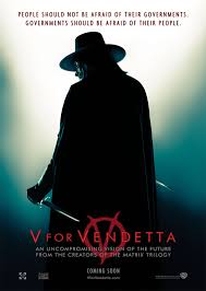
The continuity system uses a smooth and seamless style of narration through a variety of techniques, In the film Viva vendetta there are several scenes that show these techniques very thoroughly. The most important concept is the 180 degree rule. This rule states that the camera must stay on one side of the action and objects in a scene, this is an invisible line that runs through a scene and the camera never crosses this line. This is used so the audience don't get confused about where the characters are. A good example of this is in the film V for vendetta; an indoor scene with two characters.

with the 180 degree rule the viewer never really experiences any sense of spatial disorientation or inconsistent.

with the 180 degree rule the viewer never really experiences any sense of spatial disorientation or inconsistent.
Wednesday, 16 January 2013
Oceans twelve storyboard analysis


We watched a short clip of Oceans twelve and had to storyboard the different angles the camera had shown through the editing. This was good practice for when it came to editing are own short film and also in exam prep when analysing what we see.
Sunday, 6 January 2013
Title Analysis
A title sequence is the method by which cinematic films or television programs present their title, key production and cast members, or both, utilizing conceptual visuals and sound. It usually follows but should not be confused with the opening credits, which are generally nothing more than a series of superimposed text.
I looked into horror opening sequences for our group film:
James Bond -Skyfall
This is a modern example of amazing opening credits. Firstly credits are located at the most convenient location of the screen, they are not still, but are slightly moving with the current of the ocean as James Bond is sinking further into the deep sea, this is a good way of integrating the titles and the moving image, as it seems less of a disturbance and more part of the film. The font is simple, so it does not take away from the rich ingredients of moving image. The font is also white, which is a neutral colours to the variety of images used in the opening sequence, the size is acceptable, noticeable but not overwhelming.
Se7en - Starring Brad Pitt.
This is an excellent example of horror which can relate to our own opening titles. Unlike many others, it is a lot less simple. The fonts are all dynamic, not all in straight lines, some neater then others, Some spaced out further then others etc. Comparing other sequences this one is the most eye-catching and exciting, sometimes less is better, but horror in particular can be a lot more creative; it prepares the audience for tension and addiction of horror characteristics, as you get drawn into what is about to happen. The black/brown/red backgrounds and white font is a successful comparison as it really brings out the variety of titles due to its dark to light effect. It also uses a lightening effect when the music changes key, keeping it intact and attractive.
Representation
 Representation in Horror:
Horror unlike other types of media represents gender in a much more respected way, women are more active then passive in horror movies; Sometimes being the hero or the saviour. eden Lake is a good example of this. 'Halloween' (1978) has the "final girl" called laurie which is a unisex name. She is portayed as innocent but dresses in a way that makes her masculine side more visual. Steotypically, the man is the aggressor, the woman is smart and always sees the realistic side to a situation that doesnt involve danger. side is not usually a common trait in media, however horror is much more diverse. sometimes the man is the patagonist and the woman is sometimes an accomplice the dominant role. Representation in horror being stereotypical is less common then in other types of media, gender roles may have been more stereotyped in the past, such as 'psycho'1960 where the girl is portrayed weak and defeated, she is pretty and hopeless. more modern horror can play with stereotypes without it seeming fake or unrealisic.

Teen movies: Mean girls
Subscribe to:
Posts (Atom)